As we near the end of the year, we’re excited to introduce a new phase in our agency’s journey. Although our name remains the same, we’re making a significant change by updating our logo to reflect our vision for the next 5-10 years.
Your logo is the face of your brand, the first thing people see and remember. As we grow and expand our capabilities, it’s crucial that our logo mirrors our progress. By refreshing our logo, we ensure our visual identity aligns with our long-term goals. This is important for our clients, partners, and team members, as it shows our commitment to delivering even more value, staying at the forefront of the industry, and creating memorable content.
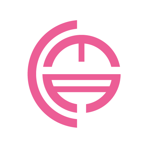
Our new logo represents the evolution and vision of our agency. It retains our original colour palette, featuring a vibrant shade of pink that symbolises creativity and innovation. Two play button arrows pointing forward within the logo represent our dedication to progress and growth, underscoring our commitment to moving forward and reaching new heights.
Embracing change also allows us to reflect on our previous logos:

2000 – 2012

2012 – 2014

2014 – 2016

2016 – 2023
Change is the driving force for growth, and our agency is fully committed to this journey. We’re excited about the new directions we’re pursuing and the opportunities that lie ahead. With the addition of fresh talent and a legacy of outstanding work, we’re more determined than ever to provide unmatched creative content solutions for our clients.
We’re always ready to provide a quote. Reach out to us, and we’ll start our process to learn more about your project. Following that, we’ll prepare a quotation specifically for you.